


She’s a big post today – full of vintage dressers-turned-vanities, a tile “border” (!!), and a claw foot tub. Today we have the official kids shared bath design plan for you and now that it’s 2 months away from use (ACK) I can tell you firsthand that it’s going to be so awesome (scroll to see sneak peeks). It’s in the hall, on the second floor, shared by a 6-year-old girl and 8-year-old boy who have no idea how much their mom has sweated over this bathroom for them. They both agreed on “green” and that’s where we started…
The Original Bathroom
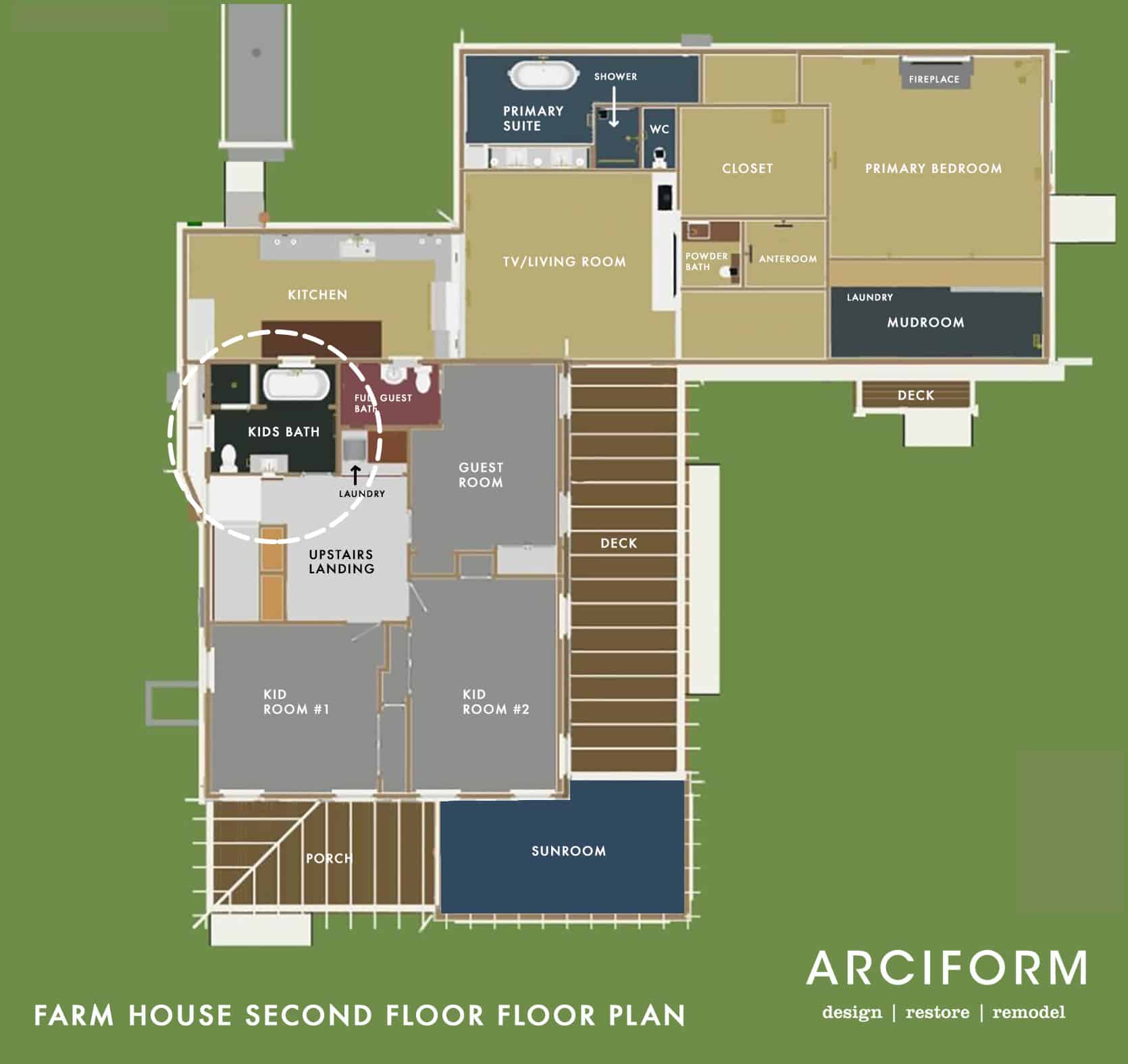
The upstairs bathroom had a nice layout before its latest renovation in the 80s or 90s, which we were able to work with…this is ALWAYS the goal with bathroom renovations because as soon as you start moving plumbing your budget takes a nice hit, so we were thrilled. They had redone it in the 90s and they did a tasteful job. Admittedly this bathroom could have been just updated, but once we looked closely there were some quality issues with the tile install (not a big deal, but a pet peeve of ARCIFORM) and for me I selfishly wanted it to go with the rest of the house. Once we realized that the whole house was to be gutted for all new electrical and plumbing, we felt that this room should be updated too. I’ll be honest in saying that this is not the earth-friendly decision to make, but it’s simply what we wanted to do. It just didn’t feel like it was of the same quality as the rest of the house. Hopefully, we can all agree (ha) that we made the right decision.
We kept the identical layout to A. save money and B. because we liked it.


We also felt that having a separate bath and shower is cute (and my preference) and it seemed right for two kids (even if they don’t bathe at the same time – we designed this bath when the kids were 4 and 6 so hilariously now that they are 6 and 8 we have exited the era of shared baths or showers). I love an enclosed shower room, and a freestanding tub, obviously – not only is this visually the most interesting, but it feels vintage and sweet.


We were able to salvage and donate the toilet, pedestal sink, and medicine cabinet and we are reusing the tub somewhere special that I can’t wait to tell you about (it involves a hose and cold plunging).
The Layout


Since we weren’t relocating any fixtures and plumbing we were left with focusing on the aesthetic design vs. layout design. We knew we wanted it to be a little whimsical but still simple, airy, and quiet. The kids were insistent on color so we brought in this dark green they both loved.
With our wish list in hand, ARCIFORM came back with the first round of designs. I knew I wanted to do this elongated picket from Pratt + Larson because it mimicked the diamond pattern in the original windows.
First Round Of Designs


It was a LOT of tile in that picket shape that I felt mimicked the diamond pattern of the original windows on the second floor. The windows in this room were simple and on the smaller side so we had plans to customize them to be more special.
There was a lot to love from the first round of designs but we wanted and NEEDED to change a few things. This is typical…So often something that looks FANTASTIC in your mind’s eye but doesn’t land when put to paper (or computer) so this back and forth process of plans and renders is so helpful.


The Custom Window Debate
The window on the left is not original to the house, but it’s real wood from the 1990s when they renovated (we think) and in fine condition. They might have added the one behind the tub as it’s kinda awkward from the exterior (but there weren’t really architects back in the day to help guide those decisions so maybe that was the original location from 1910). As we were designing this room I really wanted bigger better windows (this is a pattern with me) and I wanted them to match the wood of the original windows that we were keeping. Anne helped design these stunning windows in the renderings and I obviously approved them. We sent them off to be quoted by their other company Versatile, who would have executed them to match the originals. We know that super customized windows can be VERY expensive, so when they came back at $5k each we should have not been surprised. So we thought about it for a cool 10 minutes and realized that this room would be beautiful either way and that we simply didn’t have $10k in the budget to spend on windows in our CHILDREN’S bathroom. So while I was sad to see them go, and I think the room would have been more beautiful with them, we simply couldn’t do it. Also installing new windows isn’t free either – so it would have cost another $1k – $2500 in labor to reframe the wall to handle larger windows and then install them. No new windows in this room (and yes at times I regret not finding a vintage diamond picture window for behind the bathtub like I did for a couple other spaces – oh well).
A Bathtub Niche

We also brought the tile down to the height of a wood railing (about 3/4ths up the wall). We felt that this just broke it up and allowed us to have a peg rail in certain areas of the room.
YES, there is a tile border on the bottom, almost like a baseboard…but with teeth 🙂 I came up with this idea a year and a half ago – to bring the floor up into the wall a bit and give it a bit of whimsy. Sometimes I fear that some of my early ideas live in a different house now, but other times I’m so excited to have some rooms look more special with some risks. In-person we love it (head to Instagram stories to check it out).

Now that I’m looking at the niche with the curtains it does seem like it’s going to be crowded in there, hmmm, but I can always nix the curtain. I could have kept it open without the casing around the opening to create the niche but I like the idea of it being a little cozier. We’ll see 🙂 Right now that curtain looks super boring but I have plans for it to make it fun and whimsical.

Shower Room


The Vintage Vanity
We talk a lot about design rules and how sometimes you need to break them. This is because when done right, the unexpected design choice can be the one that makes the whole design feel special, feel GAH! So, that being said, we have this vintage chest, and as you can see it has gotten A LOT of love and use in our home over the years. It’s pine, with sweet little key holes and for whatever reason, I decided a year ago to make it our vanity. It’s going to be SO CUTE, if not a little impractical (not a ton of storage) but they’ll live.


Now some of you may have a hard time with what you are about to see…so prepare yourselves. We had Jamie from ARCIFORM template out a space for an undermount sink, cut a hole in the top of the dresser, and brace a sink from below. I promise it will be worth it!!! We will lose the full use of the top drawer and 1/2 of the second drawer to house the sink and plumbing, but will still have storage for the everyday items in the sides of the second and bottom drawers. I hope. How much storage do kids actually need right???


One of the many things we love about this piece is the curved corners and beveled edge and we wanted to figure out a way to keep that profile. Enter Anne with a clever and cool idea. She suggested we KEEP the original top and ADD a stone top with the same curved corners and beveled edges but inset 1/2″ creating a tiered effect/a RAD but subtle design moment. I also REALLY wanted a stone backsplash somewhere in this house because it is so classically “English Farmhouse” and this bathroom was the only one that stylistically made sense (but we have gone back and forth on this).

Since the top is so special we felt the backsplash should be too, initially the design had it going the length of the vanity with a small curved shelf ledge at the top like this …


It didn’t feel quite right, so then Brian had a great idea during one of our design meetings that everyone agreed worked…so this is the final backsplash design…special, unique, and works so much better with the lines of the room. We had a momentary red flag this week that we’d need to nix the stone backsplash as it might push the wall-mounted faucet out too far but Jamie re-measured and we are all good. We could absolutely have had the faucet come straight out of the tile but this way it looks more like a basin, like a found piece.


The stone for the top and backsplash is a beautiful calm Carrarra Marble from BEDROSIAN. We went back and forth on what type of material to use and ultimately decided although it is a natural material that will require some care and maintenance, marble would really look the best. I do want to warn you that there is VERY little counter space. We’re going to add some vintage wall mount cup holders for toothbrushes/toothpaste and Elliot might need a vanity in her room when she gets older. Likely going to get a train rack for above the toilet to add storage, too.
Medicine Cabinet/Mirror
The way they framed behind the vanity wall only allowed for a 14″ wide medicine cabinet and we didn’t want to have to reframe and re-drywall (and there are so few medicine cabinets that wide) so we nixed it and will find a mirror. Stay tuned on that.
Kids Design Plan Product Board

1. Fairview Two-Light Wall Sconce | 2. Eastmoreland 4″ Fitter Semi-Flush Fixture | 3. Kohler Kathryn Toilet | 4. Tolson Wall Mount Faucet | 5. Tolson Toilet Paper Holder | 6. Tolson Single Hook | 7. Lewis Push-Button Switchplate | 8. Double-Ended Clawfoot Tub | 9. Tolson Single Towel Bar | 10. Large Picket Tile
The lighting and plumbing are all from Rejuvenation and I love how playful this Tolson line is (while still being solid). The tub is not silver – it’s brass. We have a herringbone on the floor of the bath, a hex on the floor of the shower, and an elongated picket throughout (in green and white). All from Pratt and Larson.
I’m loving how it’s coming together and I have a few surprise design elements.

That border in person is a real surprising yet subtle moment that I’m so glad we did. I almost nixed it a few months ago, worried that this bathroom would be really different than the others, but the tile and the plumbing all work together, so doing an element like this is just extra fun for a kids bath.
I feel like I’ve shown you too much but don’t worry – again, we have a few surprise elements. Besides I’m sure that many of you are going to be very curious if this whole tile border thing will actually work IRL. Here’s to taking some design risks and hoping they pay off!
The post Our Kids Shared Bathroom Design Plan – A Tile Border? A Dresser As Vanity? And Just Maybe Not Enough Storage… appeared first on Emily Henderson.