


I’m back with another reveal. And this one’s been even longer in the making. Unlike our kitchen renovation, which came after a year and a half of us using the kitchen in its “bought as” state, we never got the chance to even use our primary bathroom.
When we bought the house, the primary bathroom looked like this:

It was covered in pink and teal tile, had a seemingly 50-year-old jacuzzi bathtub, and no shower. I think I peed in here maybe twice. Because pretty quickly after we got the keys, we went straight into demo.


There were so many things happening all at once during those early months, and designing the primary bathroom wasn’t one of them. But we did need to lift up all the flooring, level all the joists, remove all the damaged wall wood (from termites and mold), and run new electrical throughout the whole back of the house. And since we had a fully functional bathroom in the front of the house, it just made sense to tear out the bathroom at the same time as the rest of the back of the house. Even if that meant it was just going to sit as an empty box of subflooring and drywall for…two years and 4 months.
And sit it did. We used the front bathroom exclusively, until July 2021. That’s when the toilet was installed in the primary, and we finally didn’t have to walk all the way from our bedroom in the back of the house to the bathroom in the front of the house to pee at 2 am.
As a reminder, here’s how the floorplan of our house has evolved:

We started our renovation efforts in the front of the house – the office (which was our bedroom for the first year and a half), living room, and dining room. Then we worked on the primary bedroom (my next project), and TV room. The Primary closet came next. And then, as most of you know, we decided to pull the trigger on renovating the kitchen. Meanwhile, the primary bathroom simmered on the back burner – slowly being designed, but waiting for its moment.
What I’m about to show you may be disturbing…

This was my first ever bathroom design plan. It was basic and got the point across. Shower at the back, toilet in the bottom left corner, sink against the right wall. We had torn out the whole thing, so plumbing could go anywhere. We had design carte blanche. Also, hire me to draw your floor plans. I only work in the sophisticated program called “IG stories” and I’m very expensive.
When I first started thinking about the bathroom vibe, I went in a cleaner, more modern direction. Simple black and white with clean lines. I think I was feeling overwhelmed by the overall chaos of renovating a house, and felt like creating a more modern space would appeal to Macauley.


I really felt I was on the right path. So naturally, before my design plans were finalized, I went ahead and ordered tile, hardware, and plumbing fixtures during this “clean and modern” phase. As is typical, I was trigger happy, and we weren’t anywhere close to actually installing the bathroom. So the tiles and fixtures sat in the garage for a year, awaiting their time.
During this *time* away from the design process, I really started to find the design groove our home through working on the other space. And I found myself being pulled back into the direction of cozy traditional. Bathrooms that looked more like this:


JUST LIKE I SHOULD HAVE KNOWN I WOULD. What was a girl, with so many beautiful modern pieces already waiting in her garage, to do? I started frantically searching for inspiration that blended the two styles. Which bathrooms had black and white tile, clean black fixtures, but still felt warm and inviting?
Luckily, craftsman homes are kind of perfect for this type of mixed design. So, I started pinning images like these, which had a few key elements to counteract the starkness of the black and whites: cozy woods, warm brass, additions of color through details, and vintage decor:


These images slowed my panicking heart and soothed my anxiety. I had wiggle room in my design plans, and everything could work together if I made some strategic next steps.
First, it was bringing in a warm wood element, and I knew the vanity would be the easiest place to do this. If I went with something too light, the bathroom would skew Scandi, so we had to go walnut-toned. I’d always loved the look of vintage dressers turned vanity, but finding the exact right piece for that sort of thing seemed like Mission Impossible. So I did the next best thing and had a vanity custom made by Ross Alan Reclaimed Wood.

Here’s the drawing I sent – I wanted LOTS of storage and some cute legs. Ross and his team use all reclaimed wood, so it’d also be a nice way to bring in one more vintage element. And because our bathroom is so tight on space, by going custom I knew we were going to get a piece that would fit perfectly. AND IT DOES. The vanity set us back $2500, but handmade craftsmanship is always worth the cost if where can afford it. Once I had the vanity in the mix, the re-design process started in earnest, and I mocked up this:

Everything was feeling better, including me.
Next, I wanted to add something special to the design. Something that would feel a little old world. I had a dream of building a small arched inset into the wall above the toilet, like you see in the hallways of old estate homes or churches. A little reliquary for more tiny vintage things. I really NEEDED this element, and my contractor (dad) delivered. You can see it built out in the image below.
Now there were only two steps left in the un-modernization of the bathroom.


Originally, the bathroom was going to stay bright and white. But at this point I felt I needed a tone on the walls, to bring in the warmth I was so desperate for. I proceeded to mildly lose my mind during this phase of the design process.
I think I spent about $200+ on paint samples. When I thought I had the right color, my dad painted the whole space. Only for me to realize it was the very wrong color. TYPICAL. More paint samples, more $$$. Turned out the right color was my first choice from the mock-up all along. Listen to your stomach organs people, they collectively know you better than your head organ does.
The final step in this entire process was bringing in vintage elements to add back in some soul.
Here’s how it looks all put together…
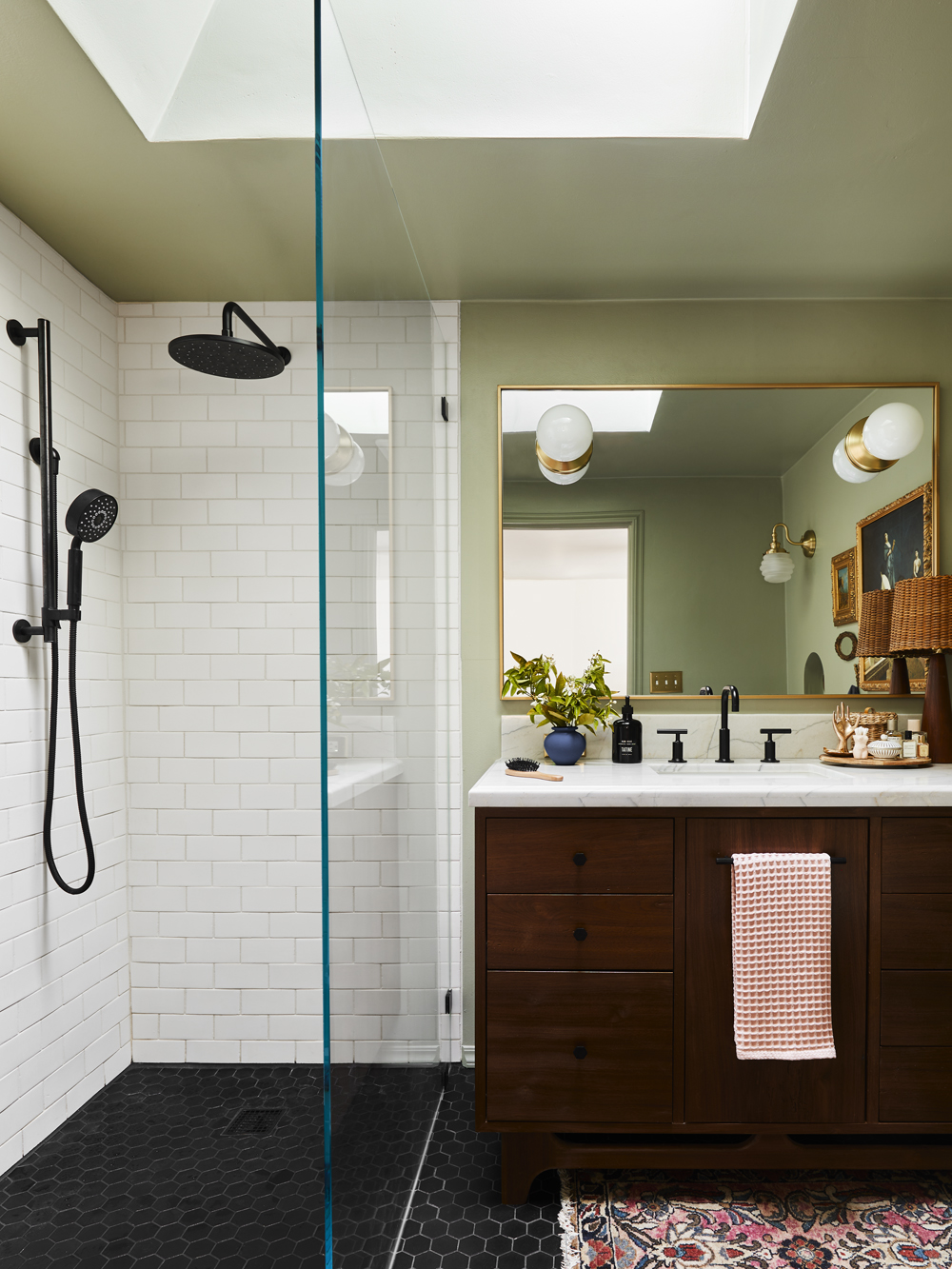
It’s still modern, but with a HEAVY dose of #somethingelsekindaold.
Being a room in the middle of the house, the bathroom originally had zero natural light. We amended this issue by installing a Velux skylight right in the middle of the space. And more than anything, I think the natural light has changed the space. There’s something about waking up and getting ready in a space that has natural sunlight streaming in that just makes my brain happier. And there’s nothing better than taking a hot shower, while a gentle breeze wafts in from an open skylight overhead.

Vanity |
Our vanity turned out exactly like my drawing, and is really beautiful. It’s got a modern shape, but the color and texture of the wood keep it feeling warm and almost soft in a way. I wanted to compliment the wood with a natural stone countertop. Something with a traditional edge cut to keep the whole piece from going too midcentury modern.
Finding the right stone was an ordeal. Stone yards just don’t sell slabs small enough for a vanity of this size. So I ended up having to drive around to all the different fabricators in the Valley, looking through their “remnant slabs.” These are pieces of larger slabs that are left over after the fabricators cut out all the counter pieces people need for their homes. The fabricators get to keep the offcuts (similar to when you have cookie dough left over after cutting out shapes), and they’ll sell them to people like them (have crazed, desperate 30 year olds who know nothing about stone, but everything about why that piece they keep telling me is really good just isn’t THE VIBE). I finally found this piece of quartz at the 5th fabricator, and they cut and installed the top for about $1200.

The mirror was the next big hurdle, because finding something that was the exact right size was hard. Admittedly I assumed we could just have a custom one made, that would easily have the holes cut out for the light fixtures, just like I imagined in my head. But, as mentioned above, anything custom is going to cost a custom price (as it should be). And after creating the vanity of my dreams, a custom mirror was just not in our budget. So I scoured the internet for a vintage or ready-made mirror that would fit size-wise (it was harder than it sounds).
The mirror itself was $200. Once it was delivered, I took it to a glass shop in Highland Park, where they took it to a special guy who sandblasted the light fixtures holes in the glass, exactly where they needed to go so our Rejuvenation sconces could sit ON the mirror. It was a whole thing and cost another $242, but the end result fits the space perfectly.

Bathroom Faucet | Sink | Rain Shower Head | Hand Shower | Shower Handle | Toilet | Toilet Seat
In the end, I’m really happy with our plumbing fixtures and think the modernness of them gives the bathroom a little bit of an edge. All of our plumbing (including the toilet and sink) were provided by Kohler. They’re absolutely beautiful, and the softest, smoothest matte black fixtures you could imagine.


The rain shower head is great for Macauley. Crouching under a shower head isn’t a favorite pastime of his, but at 6’1” it happens a lot. Not in our house though, because he can stand all the way up in our shower with room to spare. And I gotta say, having a hand shower is a luxury that I luxuriate in. Cleaning my shower has never been easier, and I love using it on days that I don’t feel like getting my hair wet.

Subway Tile (with the Portland Edge in color UWM) | Floor Tile (with the Portland Edge in color P4)
Both the floor tiles and wall tiles are from Pratt & Larson, a really lovely tile company up in Oregon. I went with Emily to visit their factory a few years ago and fell in love with both the company and the tiles. Even though I ordered the tiles during the modern phase, I still had the sense of mind to go with their organic Portland edge on both tiles, which give them a bit of a rougher, more undone look. The floor tiles are a matte finish as well, making them less slippery for safety, and less shiny for aesthetics.

I had my dad build this little ledge at the back of the shower, even though we had a nook built in over the shower faucet. I thought it would make the towel area feel more intentional, and also be the perfect place to put more things – I have a lot of them.

Blue Vase | Hand Soap (similar) | Knobs and Pulls | Hand Towel
I decided I was going to mix metals in this space. All the Kohler plumbing I had ordered was black, and I had gotten really excited when I had found these black hex knobs and pulls at West Elm that would match the floor and plumbing. But when I got all weird about the design plan, I wanted to bring in more warm tones. Adding brass to the mix felt like a good way to do that.


Outlet and Switchplate Covers | Bee Sconce
So while our plumbing and hardware are black, our electrical components and mirror frame are brass. I choose these very traditional brass switchplates from Rejuvenation that are just too pretty to photoshop out. And I found this tiny brass bumblebee sconce that really added the touch of whimsy to the space that I needed.

Rug (vintage) | Toilet | Toilet Seat | Toliet Paper Holder
The last piece of the puzzle was bringing in warm soulful details through vintage and unique pieces. I stuffed as many of them as I could into this small space. The rug is a piece that’s been with me since my first apartment bedroom with Macauley, back in 2017. It used to live in our vanity nook, but has found a new permanent home here to bring in some hits of pink and blue. The vanity nook was the first clue to what my real design style was going to be, and I would 100% not change a thing about it.
I also love the traditional and elegant shape that our toilet has. The edge of the toilet lid is so beautiful. I never thought I would say that about a toilet. You also need to know that our toilet seat is heated, so I never again have to cringe sitting down on a cold seat first thing in the morning. It’s the small things, folks.

All Art (vintage) | Candle | Box
My little nook idea turned out better than I could have imagined, and I found the perfect beehive-shaped sconce to live above it. Hilariously the first sconce we got had a defective screw, and we went through TWO lampshades before we realized what the issue was. This is sconce shade #3, and hopefully will survive much longer.


I found that tiny Angel Gabriel painting for $45 the very same morning I was going to shoot this space, at the Rose Bowl Flea. It was a last-minute find, but feels like it was always meant to go there. And my porcelain bust finally has a worthy home. All the orange blossoms are clippings from my front yard tree and is one of my favorite scents in the whole world.
The oval mirror I something I picked up at an antique store in North Carolina, and the painting above it is something I picked up at a vintage store in Atlanta (the same place I got my painted dog tray I have in the kitchen). The antique shopping outside of California is insane and so good. I think the mirror was like $20, and the painting (FRAMED!) was $15. It’s such a beautiful painting too! And I’m obsessed with my tiny, brass, dancing people towel hook.

The large bathing ladies painting was another Rose Bowl find from a few weeks ago, and I nabbed it for $50 (but then spent $160 getting it framed). I love the hits of blues, pinks, and reds that it brings, and the tiny floral details throughout. And that wood and rattan lamp is made up of two different vintage pieces I put together (previously living on our bar cart in the dining room). We have a lot of different lighting options in this space, and I like having the table lamp option for a moody shower vibe or a late-night restroom trip, so I don’t wake Macauley up.
Oh, and the paint color we ended up going with? It’s called Road To Todos Santos, by Backdrop. A creamy, warm, sage green that reminds me of Victorian parlor rooms and lazy summer days. In a brighter, more open space it’s going to look more like a muted sage. But in our tiny bathroom, with all the brass and wood it goes a bit yellower.

There you have it – My modern bathroom, turned traditional, with a dash of vintage whimsy. A true meeting of the minds between Macauley (graphic, modern, and clean) and me (whimsical, traditional, and stuffed with lots of things).
And if you’re curious what our bathroom looks like on a normal, non-shoot styled day, pop over to Em’s stories on Instagram for a peek 
*Design and Photos by Sara Ligorria-Tramp
**Styled by Emily Bowser
The post How Sara Course Corrected Her Initial “Clean, Modern, And Very Neutral” Primary Bath Design Plan Into The Actual Design She Wanted – It’s A Suprise Reveal! appeared first on Emily Henderson.