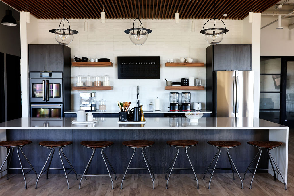
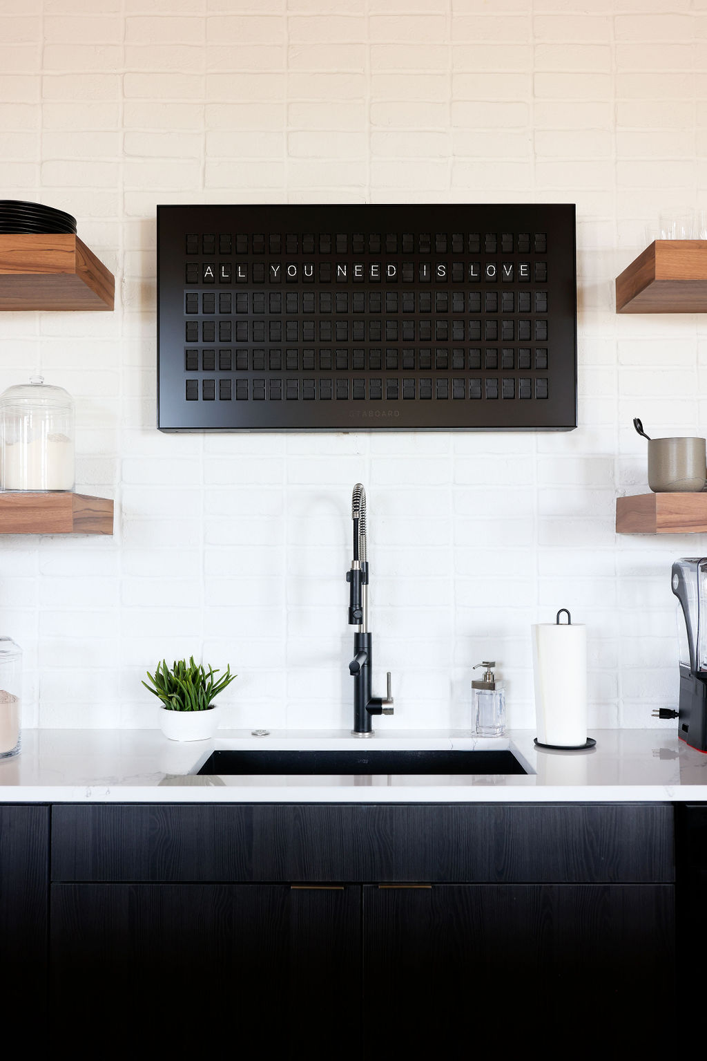
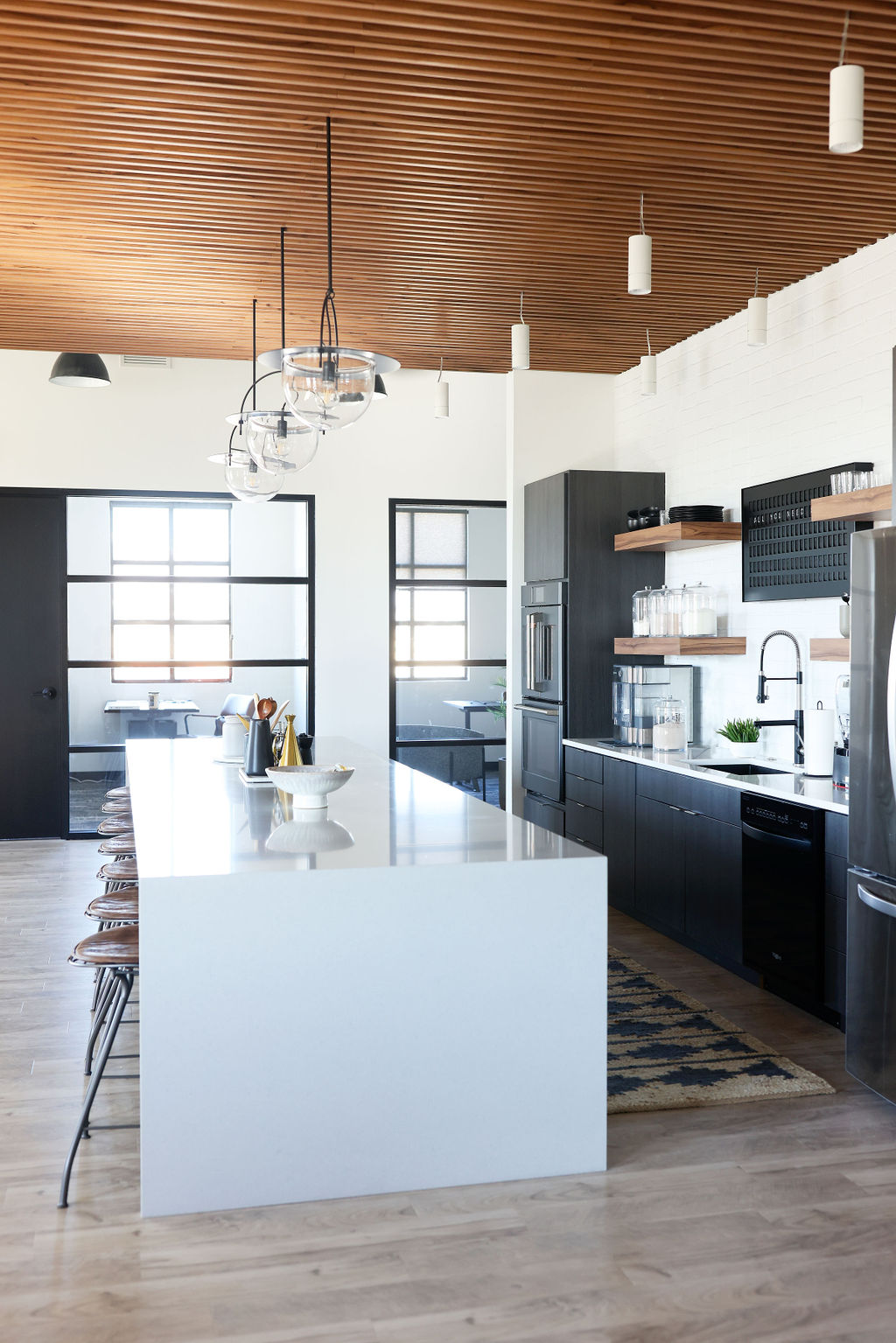
We revealed the Clean Simple Eats corporate office space just last week and we have to admit that it is one of our favorite client projects yet! We are excited to share with you a more in-depth look at the kitchen and give you a chance to shop the space and recreate this stunning modern kitchen design in your own home.
The idea behind the design was to create a simple, and beautiful space that fit right into the lifestyle and vibe of the Clean Simple Eats brand. Since the kitchen is at the heart of what they do, we wanted to design a kitchen space that was equally as functional as it is beautiful!
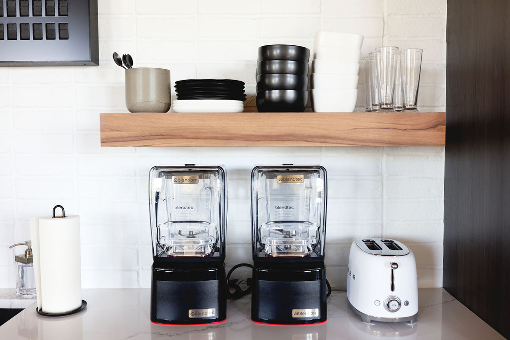
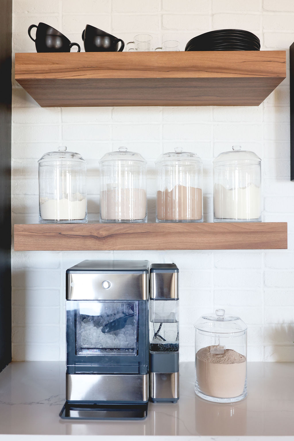
Part of the functionality of this space means having blenders, pretty dishes, and plenty of serveware easily accessible and within reach. Since this space will be used as a backdrop for filming, we went with a sleek open shelving look.
The kitchen wouldn’t be complete without a protein bar featuring some of the favorite Clean Simple Eats proteins and milkshake glasses for a pretty presentation!
The space is perfectly set up to be used by employees, for filming content, or for testing recipes. Clean and Simple are in the name and we definitely wanted their corporate space to reflect that.
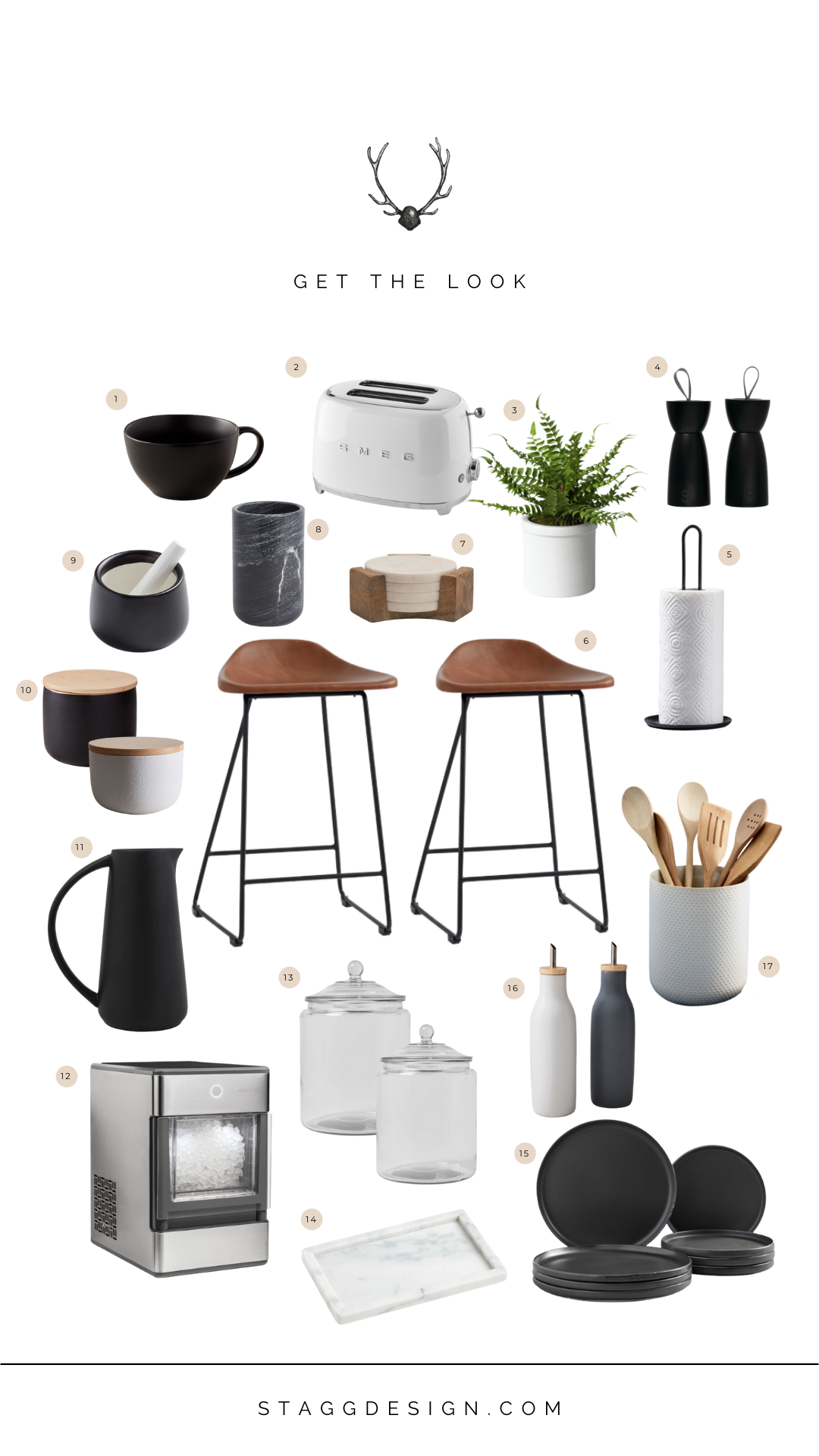
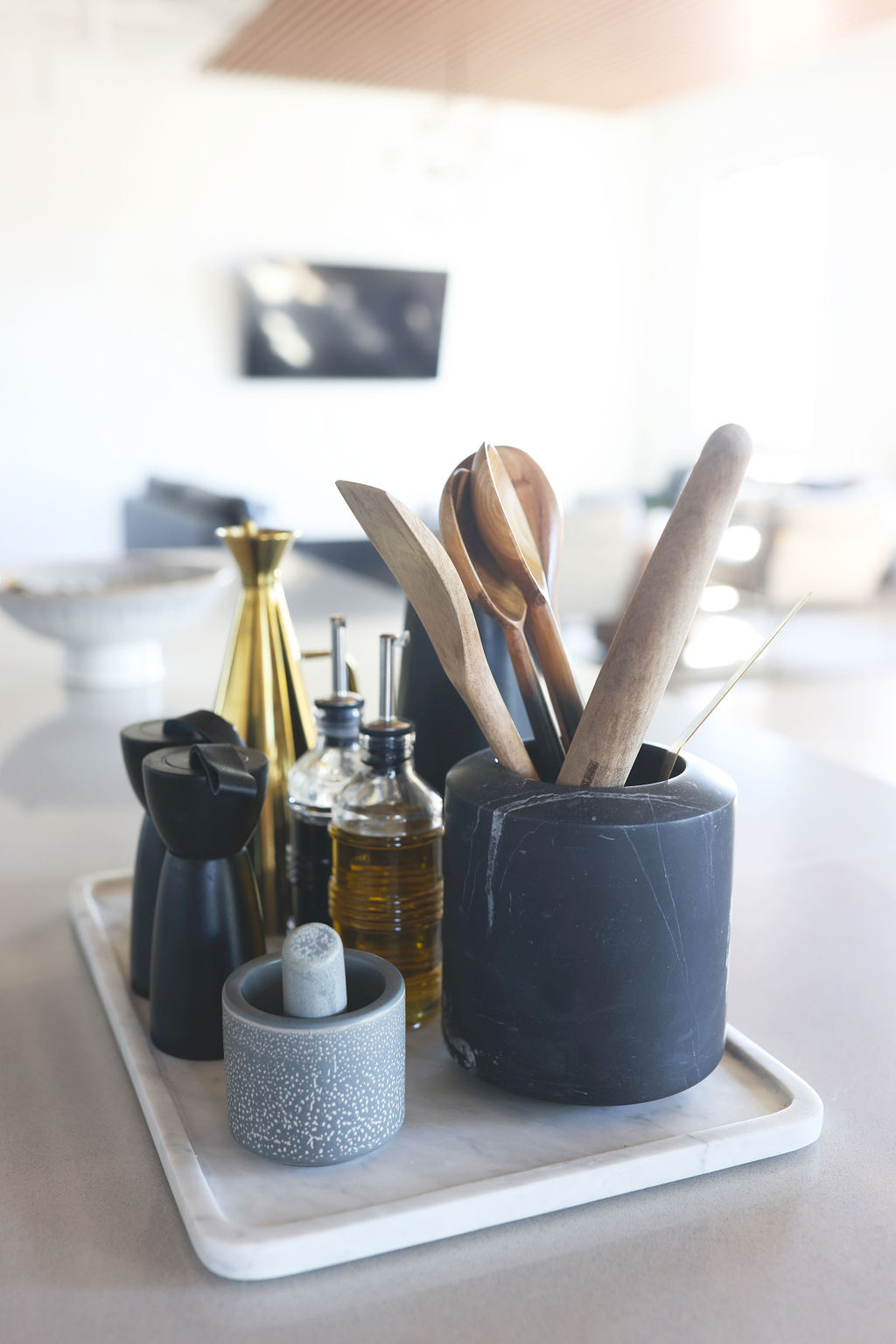
17. Textured Utensil Holder
The post Get the Look: Clean Simple Eats Office Kitchen appeared first on Stagg Design.


